12. Working with Data III: Case Study
In this chapter we introduce a case study using Corona virus data. We will track infection rates and plot figures using the latest data tracking the spread of the corona virus.
12.1. Importing Data
We will be working with data from the Johns Hopkins Whiting School of Engineering, Center for Systems Science and Engineering. Their Github portal is at: https://github.com/CSSEGISandData
This is the data repository for the 2019 Novel Coronavirus Visual Dashboard operated by the Johns Hopkins University Center for Systems Science and Engineering (JHU CSSE). Also, Supported by ESRI Living Atlas Team and the Johns Hopkins University Applied Physics Lab (JHU APL).
You can find their dashboard with all the visual information under this link: Dashboard
We will use their data (it’s updated twice daily) and make our own graphs.
We first need to import the data from their website. We can simply do this with
a Pandas function .read_csv().
import pandas as pd
import numpy as np
import matplotlib.pyplot as plt

# ----------------------------------------
i_downloadData = 1   # Indicator flag whether you want to freshly download the
                     # data
# ----------------------------------------

if i_downloadData == 1:
    urlBase = 'https://raw.githubusercontent.com/CSSEGISandData/COVID-19/master/csse_covid_19_data/csse_covid_19_time_series/'
    urlConf = urlBase + 'time_series_covid19_confirmed_global.csv'
    urlDead = urlBase + 'time_series_covid19_deaths_global.csv'
    urlRec  = urlBase + 'time_series_covid19_recovered_global.csv'

    # Download and Save
    dfConf = pd.read_csv(urlConf, on_bad_lines='skip')
    #dfConf.to_pickle('CoronaConfirmed')

    dfDead = pd.read_csv(urlDead, on_bad_lines='skip')
    #dfDead.to_pickle('CoronaDeath')

    dfRec = pd.read_csv(urlRec, on_bad_lines='skip')
    #dfRec.to_pickle('CoronaRecovered')
Note
If you want to locally store the data and not download the data everytime you run your script file you could save the data first with:
# Save data locally on harddrive
dfConf.to_pickle('CoronaConfirmed')
dfDead.to_pickle('CoronaDeath')
dfRec.to_pickle('CoronaRecovered')
And then simply read it from your harddisk using:
# Read data from harddrive
dfConf = pd.read_pickle('CoronaConfirmed')
dfDead = pd.read_pickle('CoronaDeath')
dfRec= pd.read_pickle('CoronaRecovered')
You would then of course have to “outcomment” the webreading section above
or set the i_downloadData flag equal to zero so that the downloading
part gets skipped.
Instead of saving the data to a file I will simply assign the imported data into a new dataframe that I am not going to manipulate.
dfConf_orig = dfConf.copy()
dfDead_orig = dfDead.copy()
dfRec_orig  = dfRec.copy()
For each application I will then copy the original data from the _orig
dataframes.
Have a careful look at the data. Use the Variable Explorer tab in Spyder to investigate the dataframe. The nature of your data is basically an observation over time of confirmed corona virus infections by Province/State as the “smallest” geographical denominator. You also know which country the Pronvince/State belongs to (you see this in the second column) and then you also have the Latitude/Longitude coordinates of the Province/State from which the corona cases are reported from. This is followed by daily observations from this Province/State.
12.2. Plotting Cases of Infections
I first copy the original data into new dataframes because I want to keep the raw data intact and untouched in case I want to come back to it later, which we will!
dfConf = dfConf_orig.copy()
dfDead = dfDead_orig.copy()
dfRec  = dfRec_orig.copy()
We next add a column with the sum of all the confirmed coronavirus cases for
each Province/State. In other words, we
sum up all the columns of the time series of cases which starts in column five,
so that we go from [4:] to the end.
dfConf['Confirmed']=dfConf.iloc[:,-1]
dfDead['Dead']=dfDead.iloc[:,-1]
dfRec['Recovered']=dfRec.iloc[:,-1]
We then drop the entire time series and only keep the overall sum of cases. We are not interested in the single day observations for this first summary graph.
dfConf.drop(dfConf.iloc[:, 4:-2], inplace = True, axis = 1)
dfDead.drop(dfDead.iloc[:, 4:-2], inplace = True, axis = 1)
dfRec.drop(dfRec.iloc[:, 4:-2], inplace = True, axis = 1)
We next merge the three dataframes together by Province/State, Country/Region, Lat, and
Long variables so that we have the sum of all confirmed infection cases,
the sum of all corona virus associated deaths, and the sum of all the recovered
cases for each Province/State in the same dataframe.
dftemp = pd.merge(dfConf, dfDead, \
   on=['Province/State', 'Country/Region','Lat','Long'], how='inner')
df = pd.merge(dftemp, dfRec, \
   on=['Province/State', 'Country/Region','Lat','Long'], how='inner')
We have now one dataframe with the sum of all confirmed coronavirus cases, the sum of all deaths due to corona virus, as well as the sum of all recorded recoveries from a coronavirus infection.
We next plot the infection cases by their latitude and longitude of the province/state where they were recorded. We plot circles and use the number of cases per 1000 as circle size. The larger the circle in the plot, the more cases have been recorded for the Latitude/Longitude coordinate.
ax = df.plot(kind="scatter", x="Long", y="Lat", alpha=0.4,
    s=df["Confirmed"]/1000, label="Confirmed Infections", color = "Blue")
df.plot(kind="scatter", x="Long", y="Lat", alpha=0.4,
    s=df["Dead"]/1000, label="Deaths", color="Red", ax=ax)
plt.legend()
plt.show()
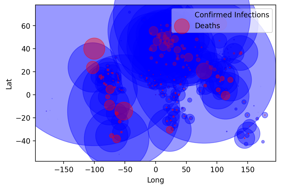
From this graph you can already see the outline of countries. However, it would be better if we could superimpose the information onto a real map of the world. We do this next.
12.3. Plotting Cases of Infections on a Map
We next use the Cartopy library to plot the same information superimposed on a worl map.
Note
You will need to install the cartopy library via the command line. Open
a command line terminal and type:
conda install -c conda-forge cartopy
Followed by enter, then hit y for yes when it prompts you. This should
install the cartopy library.
We will next import the cartopy library.
import cartopy.crs as ccrs
fig = plt.figure(figsize=(14, 14))
ax = plt.axes(projection=ccrs.PlateCarree())
ax.coastlines()
plt.scatter(df['Long'].values, df['Lat'].values, transform=ccrs.PlateCarree(), \
        label=None, s=df["Confirmed"]/1000, c="Blue", linewidth=0, alpha=0.4)
plt.scatter(df['Long'].values, df['Lat'].values, transform=ccrs.PlateCarree(), \
        label=None, s=df["Dead"]/1000, c="Red", linewidth=0, alpha=0.4)

plt.legend()
plt.show()
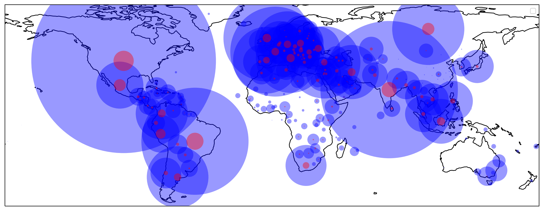
You now have a nice plot of the world map and the corona cases superimposed on it.
12.4. Plotting Time Series of Cases
We now go back to the original dataframe with the time series data of confirmed
coronavirus cases. We then drop some variables that we do not need, such as
Province/State, Lat, and Long.
# Here is the original data again
dfConf = dfConf_orig.copy()
dfDead = dfDead_orig.copy()
dfRec  = dfRec_orig.copy()
Now pick the confirmed cases and drop some columns
dfConf_t = dfConf
dfConf_t = dfConf_t.drop(columns = ['Province/State', 'Lat', 'Long'])
Let us have a look at the first three rows to see how our raw data look like.
print(dfConf_t[0:3])
  Country/Region  1/22/20  1/23/20  1/24/20  1/25/20  1/26/20  1/27/20
\
0    Afghanistan        0        0        0        0        0        0
1        Albania        0        0        0        0        0        0
2        Algeria        0        0        0        0        0        0

   1/28/20  1/29/20  1/30/20  ...  1/17/22  1/18/22  1/19/22  1/20/22
\
0        0        0        0  ...   158826   158974   159070   159303
1        0        0        0  ...   233654   236486   239129   241512
2        0        0        0  ...   226749   227559   228918   230470

   1/21/22  1/22/22  1/23/22  1/24/22  1/25/22  1/26/22
0   159516   159548   159649   159896   160252   160692
1   244182   246412   248070   248070   248859   251015
2   232325   234536   236670   238885   241406   243568

[3 rows x 737 columns]
We next add up all the cases for each day by Country/Region using the
groupby() function that comes with Pandas.
dfConf_t = dfConf_t.groupby('Country/Region').sum()
And again, let us peek at the data real quick.
print(dfConf_t[0:3])
                1/22/20  1/23/20  1/24/20  1/25/20  1/26/20  1/27/20
1/28/20  \
Country/Region
Afghanistan           0        0        0        0        0        0
0
Albania               0        0        0        0        0        0
0
Algeria               0        0        0        0        0        0
0

                1/29/20  1/30/20  1/31/20  ...  1/17/22  1/18/22
1/19/22  \
Country/Region                             ...
Afghanistan           0        0        0  ...   158826   158974
159070
Albania               0        0        0  ...   233654   236486
239129
Algeria               0        0        0  ...   226749   227559
228918

                1/20/22  1/21/22  1/22/22  1/23/22  1/24/22  1/25/22
1/26/22
Country/Region
Afghanistan      159303   159516   159548   159649   159896   160252
160692
Albania          241512   244182   246412   248070   248070   248859
251015
Algeria          230470   232325   234536   236670   238885   241406
243568

[3 rows x 736 columns]
We now transpose the dataframe because we want the time observations as rows and not columns.
dfConf_t = dfConf_t.T
print(dfConf_t[0:3])
Country/Region  Afghanistan  Albania  Algeria  Andorra  Angola  \
1/22/20                   0        0        0        0       0
1/23/20                   0        0        0        0       0
1/24/20                   0        0        0        0       0

Country/Region  Antigua and Barbuda  Argentina  Armenia  Australia
Austria  \
1/22/20                           0          0        0          0
0
1/23/20                           0          0        0          0
0
1/24/20                           0          0        0          0
0

Country/Region  ...  United Kingdom  Uruguay  Uzbekistan  Vanuatu
Venezuela  \
1/22/20         ...               0        0           0        0
0
1/23/20         ...               0        0           0        0
0
1/24/20         ...               0        0           0        0
0

Country/Region  Vietnam  West Bank and Gaza  Yemen  Zambia  Zimbabwe
1/22/20               0                   0      0       0         0
1/23/20               2                   0      0       0         0
1/24/20               2                   0      0       0         0

[3 rows x 196 columns]
We are now ready to convert the index of the dataframe into a date index so that we can use the built in time series commands in Pandas.
# Converting the index as date
dfConf_t.index = pd.to_datetime(dfConf_t.index)
print(dfConf_t[0:3])
Country/Region  Afghanistan  Albania  Algeria  Andorra  Angola  \
2020-01-22                0        0        0        0       0
2020-01-23                0        0        0        0       0
2020-01-24                0        0        0        0       0

Country/Region  Antigua and Barbuda  Argentina  Armenia  Australia
Austria  \
2020-01-22                        0          0        0          0
0
2020-01-23                        0          0        0          0
0
2020-01-24                        0          0        0          0
0

Country/Region  ...  United Kingdom  Uruguay  Uzbekistan  Vanuatu
Venezuela  \
2020-01-22      ...               0        0           0        0
0
2020-01-23      ...               0        0           0        0
0
2020-01-24      ...               0        0           0        0
0

Country/Region  Vietnam  West Bank and Gaza  Yemen  Zambia  Zimbabwe
2020-01-22            0                   0      0       0         0
2020-01-23            2                   0      0       0         0
2020-01-24            2                   0      0       0         0

[3 rows x 196 columns]
Drop the last observation because it is an empty row.
if np.sum(dfConf_t.iloc[-1,:].values) > 0:
    # Do nothing
    print('Data complete.')
else:
    # If data is not there yet, drop last row
    dfConf_t = dfConf_t[:-1]
#end
Data complete.
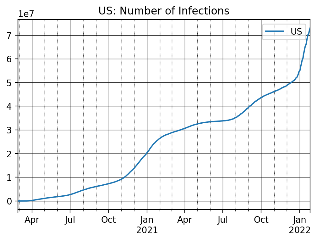
We are now ready to plot the time series for different countries. We can choose the number of days we want to plot. Here we choose the most recent 700 observations.
nrObs = -700  # Just plot the recent 700 obs (days)

ax = dfConf_t['US'].iloc[nrObs:].plot()

ax.set_title('US: Number of Infections')
# Customize the major grid
ax.grid(which='major', linestyle='-', linewidth='0.5', color='Black')
# Customize the minor grid
ax.grid(which='minor', linestyle=':', linewidth='0.5', color='black')
plt.legend()
plt.show()
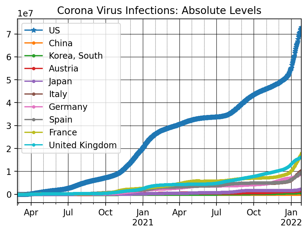
In order to plot multiple countries into a single graph, I first make a list of countries and then run a loop over this list and invoke the plot command. Otherwise we would have a lot of repeat code which is bad programming style.
#%% Plot

countryList = ['US', 'China', 'Korea, South', 'Austria', 'Japan', 'Italy', \
                'Germany', 'Spain', 'France', 'United Kingdom']

# Shorter list for alternative graph
# countryList = ['US', 'Korea, South', 'Austria', 'Japan', \
#                'Germany', 'Spain', 'France', 'United Kingdom']

nrObs = -700

ax = dfConf_t[countryList[0]].iloc[nrObs:].plot(marker = '*')
for x in countryList[1:]:
    dfConf_t[x].iloc[nrObs:].plot(ax=ax, marker = '.')

ax.set_title('Corona Virus Infections: Absolute Levels')
# Customize the major grid
ax.grid(which='major', linestyle='-', linewidth='0.5', color='Black')
# Customize the minor grid
ax.grid(which='minor', linestyle=':', linewidth='0.5', color='black')
plt.legend()
plt.show()
We next investigate the changes in the numbers from one day to the next using
the diff() function. It basically subtracts consecutive observations from
each other, i.e., it takes the number of infections from day t and
subtracts the number of infections from the prior day t-1.
ax = dfConf_t[countryList[0]].iloc[nrObs:].diff().plot(marker = '*')
for x in countryList[1:]:
    dfConf_t[x].iloc[nrObs:].diff().plot(ax=ax, marker = '.')

ax.set_title('Corona Virus Infections: Daily Increases')
# Customize the major grid
ax.grid(which='major', linestyle='-', linewidth='0.5', color='Black')
# Customize the minor grid
ax.grid(which='minor', linestyle=':', linewidth='0.5', color='black')
plt.legend()
plt.show()
12.5. Plotting Time Series of Corona Virus Deaths
We again need to transform the data into a time series dataframe first.
# Death Rates
dfDead_t = dfDead
dfDead_t = dfDead_t.drop(columns = ['Province/State', 'Lat', 'Long'])
dfDead_t = dfDead_t.groupby('Country/Region').sum()
dfDead_t = dfDead_t.T
# Converting the index as date
dfDead_t.index = pd.to_datetime(dfDead_t.index)
if np.sum(dfDead_t.iloc[-1,:].values) > 0:
    # Do nothing
    print('Data complete.')
else:
    # If data is not there yet, drop last row
    dfDead_t = dfDead_t[:-1]
#end
Data complete.
And we can now plot the information. We again start with the absolute levels.
ax = dfDead_t[countryList[0]].iloc[nrObs:].plot(marker = '*')
for x in countryList[1:]:
    dfDead_t[x].iloc[nrObs:].plot(ax=ax, marker = '.')

ax.set_title('Corona Virus Deaths: Absolute Levels')
# Customize the major grid
ax.grid(which='major', linestyle='-', linewidth='0.5', color='Black')
# Customize the minor grid
ax.grid(which='minor', linestyle=':', linewidth='0.5', color='black')
plt.legend()
plt.show()
The daily changes in number of deaths can be plotted as follows
ax = dfDead_t[countryList[0]].iloc[nrObs:].diff().plot(marker = '*')
for x in countryList[1:]:
    dfDead_t[x].iloc[nrObs:].diff().plot(ax=ax, marker = '.')

ax.set_title('Corona Virus Deaths: Daily Increases')
# Customize the major grid
ax.grid(which='major', linestyle='-', linewidth='0.5', color='Black')
# Customize the minor grid
ax.grid(which='minor', linestyle=':', linewidth='0.5', color='black')
plt.legend()
plt.show()
12.6. Key Concepts and Summary
Note
Importing data from Github
Plotting scatterplots
Plotting time series data
Differencing time series data
12.7. Self-Check Questions
Todo
Generate graphs that track the corona virus infection rates for all 50 US states
Generate graphs that show the daily change of number of infections for all 50 US states.