import numpy as np
import matplotlib.pyplot as plt
# The seaborn package makes your plots look nicer
import seaborn as sns
# Imports system time module to time your script
import time

plt.close('all')  # close all open figures
tic = time.perf_counter()
8 Plotting using matplotlib
In this chapter we explore some of the graphical functionality of Python. We first import the required libraries for plotting.
8.1 Plotting Vectors and Arrays
8.1.1 Plotting Simple Vectors
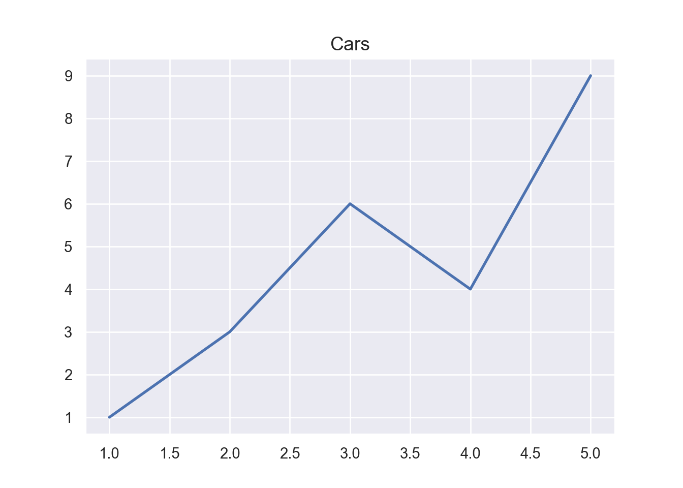
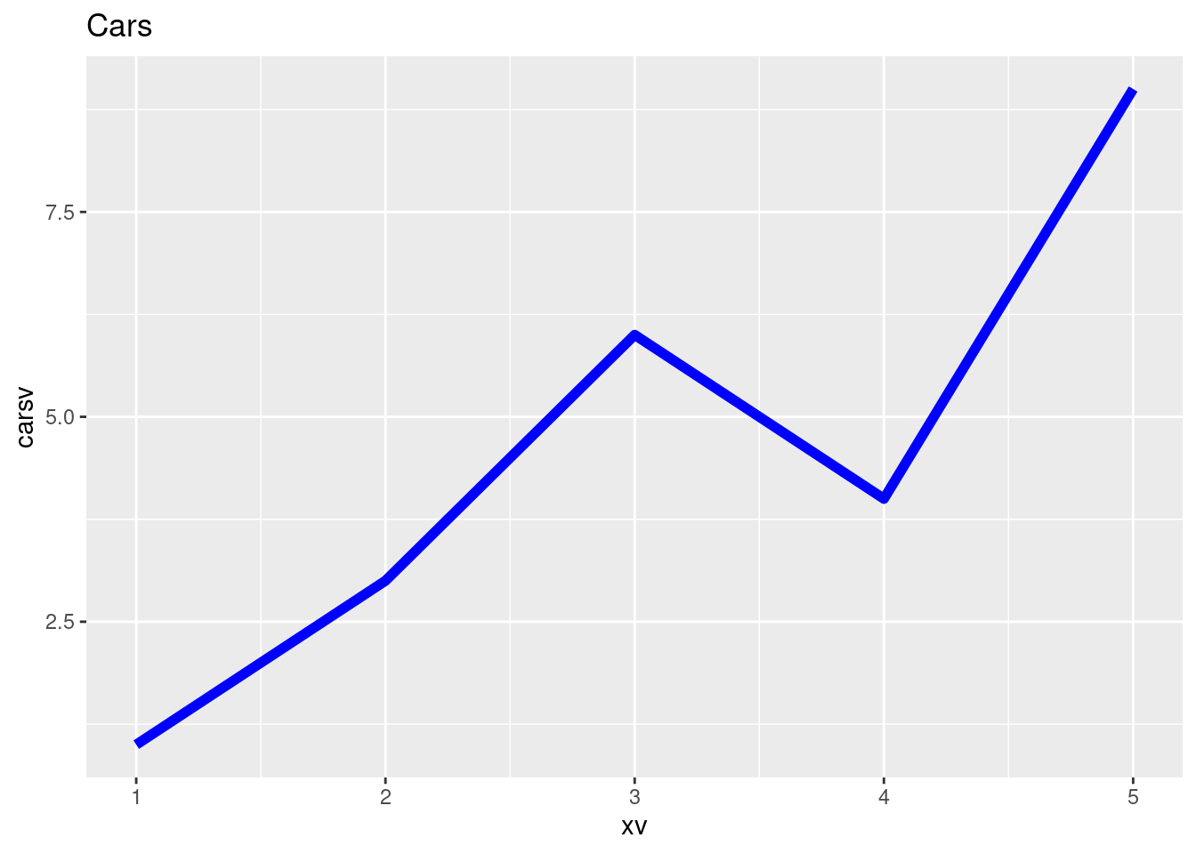
We first define a grid vector xv. We then plot the first vector using the plot() command in Figure 8.1 below:
xv = np.array([1, 2, 3, 4, 5])
carsv = np.array([1, 3, 6, 4, 9])

# Set the theme to gray, similar to gray ggplot() theme in R
sns.set_theme()
plt.plot(xv, carsv, 'b-', linewidth=2)
plt.title('Cars', fontsize=14)
# Save graphs in subfolder Graphs under name: fig1.pdf
#plt.savefig('./Graphs/fig0.pdf')
#plt.show()library(ggplot2)
xv <- c(1, 2, 3, 4, 5)
carsv <- c(1, 3, 6, 4, 9)
data <- data.frame(xv, carsv)
ggplot(data, aes(x = xv, y = carsv)) +
geom_line(color = "blue", linewidth = 2) +
labs(title = "Cars", fontsize = 14) +
theme_gray() # Using a custom theme for nicer plots8.1.2 Plotting Two Vectors
We first define a couple of vectors.
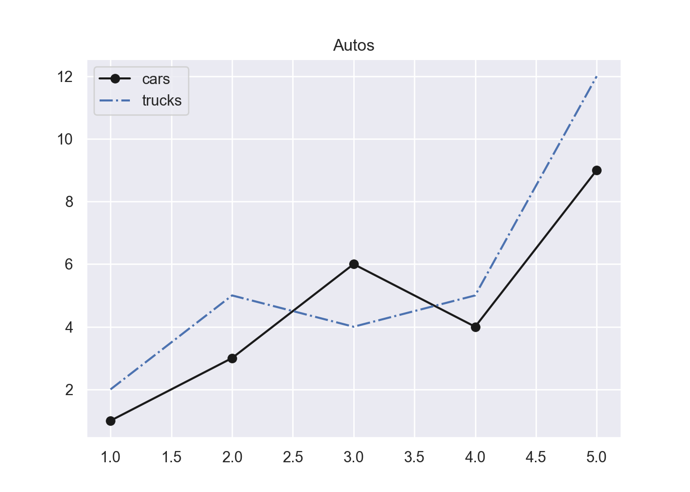
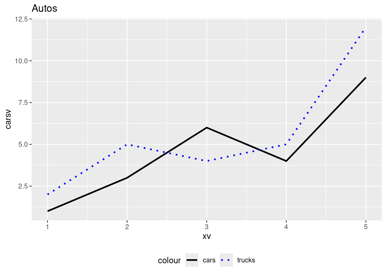
We then plot the carsv and the trucksv vector into one graph in Figure 8.3.
ggplot(data, aes(x = xv)) +
  geom_line(aes(y = carsv, color = "cars"), linetype = "solid", size = 1) +
  geom_line(aes(y = trucksv, color = "trucks"), linetype = "dotted", size = 1) +
  labs(title = "Autos") +
  scale_color_manual(values = c("cars" = "black", "trucks" = "blue")) +
  theme_gray() +
  theme(legend.position = "bottom")
Warning: Using `size` aesthetic for lines was deprecated in ggplot2 3.4.0.
ℹ Please use `linewidth` instead.8.1.3 Graph 3 Car Types
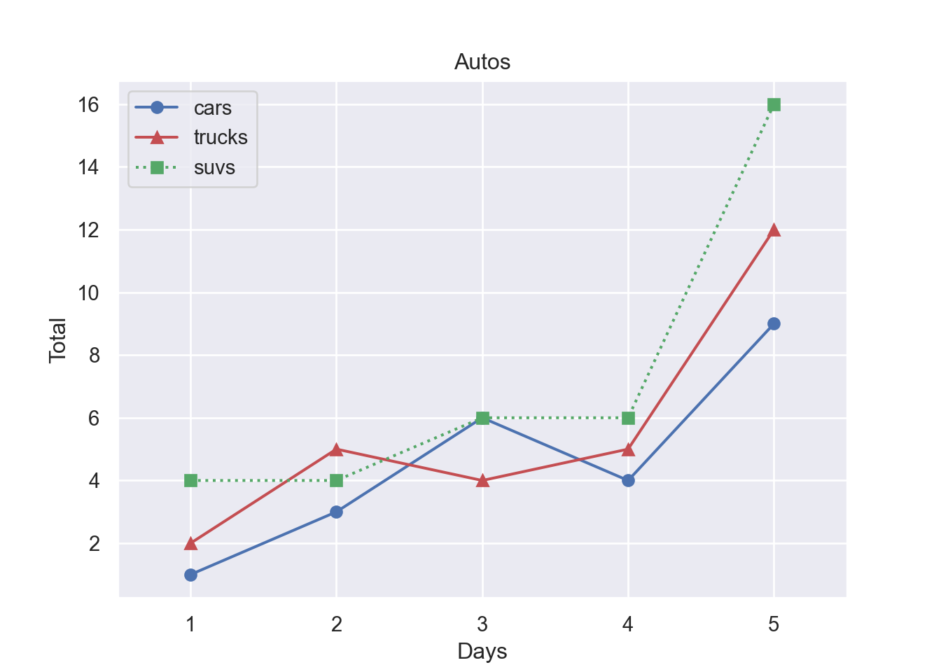
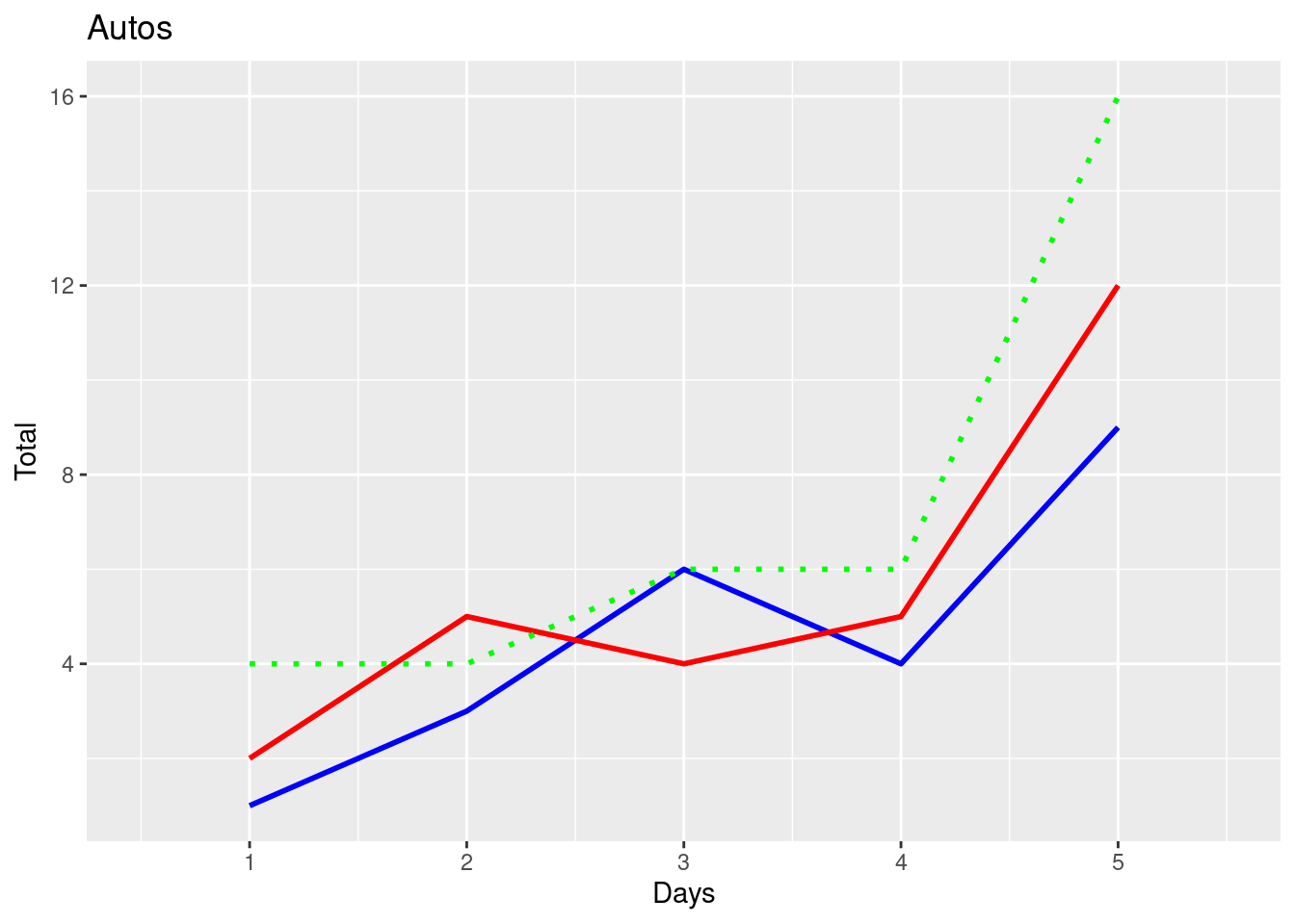
Finally, we graph all three car types into one figure. This time we save the graph as fig1.pdf into subfolder Graphs. Figure 8.5 shows the resulting graph.
fig, ax = plt.subplots()
ax.plot(xv, carsv, 'b-o', xv, trucksv,'r-^', xv, suvsv, 'g:s')
ax.set_title('Autos')
ax.set_xlabel('Days')
ax.set_ylabel('Total')
ax.set_xlim([0.5,5.5])
#ylim(min(cars,trucks),max(cars,trucks))
# Create a legend
(0.5, 5.5)ax.legend(['cars', 'trucks', 'suvs'], loc = 'best')
# Save graphs in subfolder Graphs under name: fig1.pdf
#plt.savefig('./Graphs/fig1.pdf')
plt.show()ggplot(data, aes(x = xv)) +
geom_line(aes(y = carsv, color = "cars"), linetype = "solid", size = 1, shape = 18) +
geom_line(aes(y = trucksv, color = "trucks"), linetype = "solid", size = 1, shape = 17) +
geom_line(aes(y = suvsv, color = "suvs"), linetype = "dotted", size = 1, shape = 15) +
labs(title = "Autos", x = "Days", y = "Total") +
scale_color_manual(values = c("cars" = "blue", "trucks" = "red", "suvs" = "green")) +
scale_shape_manual(values = c("cars" = 18, "trucks" = 17, "suvs" = 15)) +
coord_cartesian(xlim = c(0.5, 5.5)) +
theme_gray() +
theme(legend.position = "best")Warning in geom_line(aes(y = carsv, color = "cars"), linetype = "solid", :
Ignoring unknown parameters: `shape`Warning in geom_line(aes(y = trucksv, color = "trucks"), linetype = "solid", :
Ignoring unknown parameters: `shape`Warning in geom_line(aes(y = suvsv, color = "suvs"), linetype = "dotted", :
Ignoring unknown parameters: `shape`Warning: No shared levels found between `names(values)` of the manual scale and the
data's shape values.8.2 Plotting Functions
8.2.1 First Example
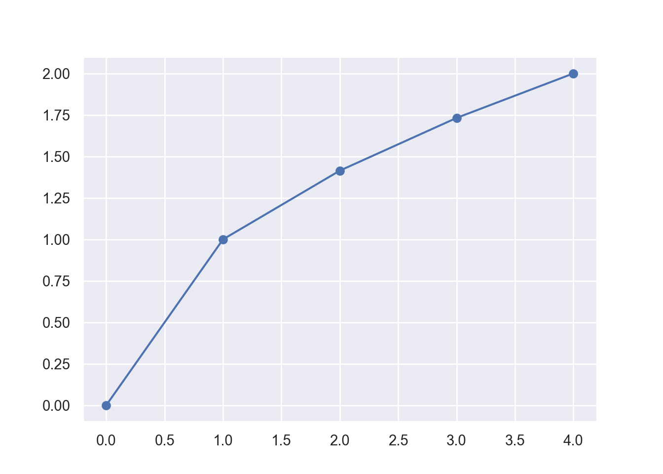
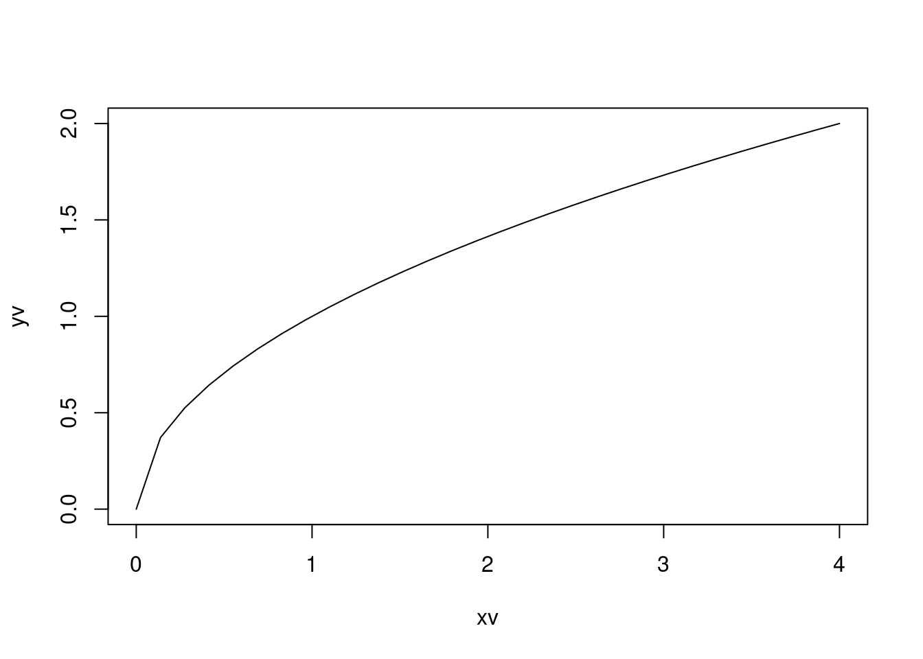
If we want to plot a more general function like the \(y = \sqrt{x}\) we first need to define a grid of x values and then calculate the corresponding y-values for each grid point. This results in x and y coordinates for a number of points that we can then add to a coordinate system. After connecting these points in the graph, we get our function plot of the square root function.
Each row represents the x and y coordinates of points that we now plot into the coordinate system. Let’s define the vectors first.
import numpy as np
import matplotlib.pyplot as plt

xv = np.array([0, 1, 2, 3, 4])
yv = np.zeros(len(xv))


print('--------------')
print('x      |    y  ')
print('--------------')
for i in range(len(xv)):
    yv[i] = np.sqrt(xv[i])
    print('{:5.2f}  | {:5.2f}'.format(xv[i],yv[i]))

print('--------------')
--------------
x | y
--------------
0.00 | 0.00
1.00 | 1.00
2.00 | 1.41
3.00 | 1.73
4.00 | 2.00
--------------xv <- c(0, 1, 2, 3, 4)
yv <- numeric(length(xv))
cat('--------------\n')
cat('x | y \n')
cat('--------------\n')
for (i in 1:length(xv)) {
yv[i] <- sqrt(xv[i])
cat(sprintf('%5.2f | %5.2f\n', xv[i], yv[i]))
}
cat('--------------\n')--------------
x | y
--------------
0.00 | 0.00
1.00 | 1.00
2.00 | 1.41
3.00 | 1.73
4.00 | 2.00
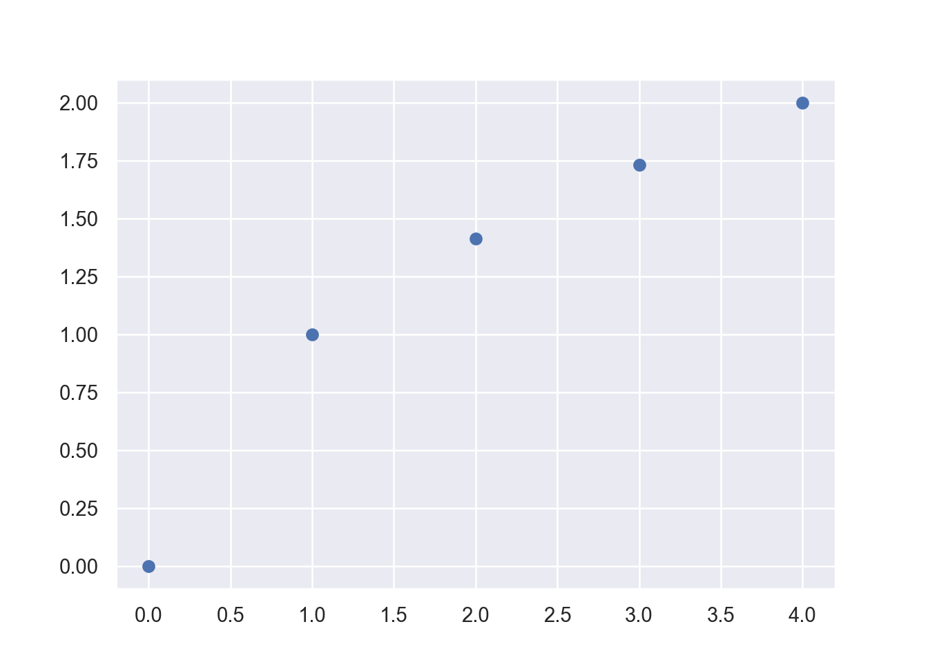
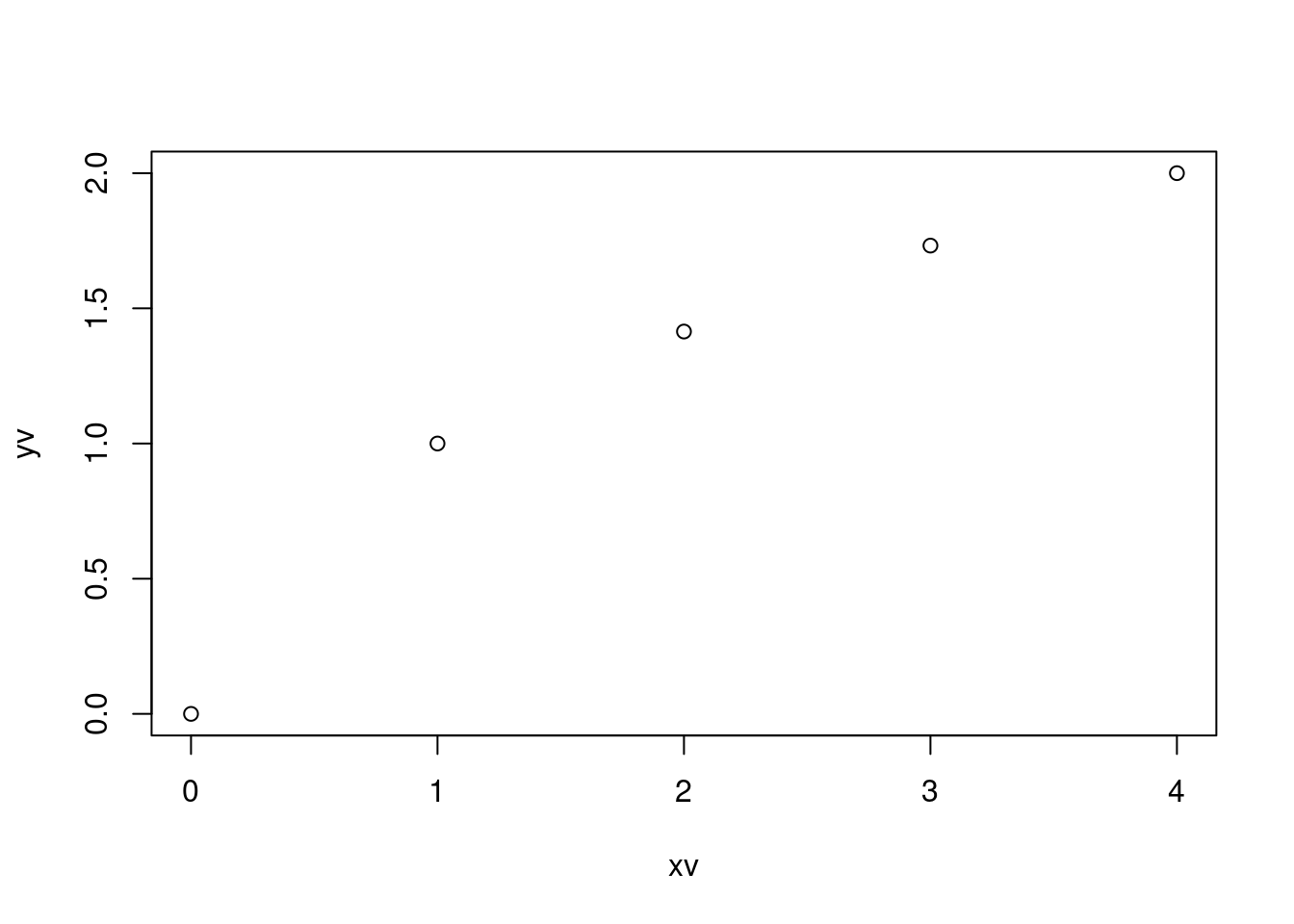
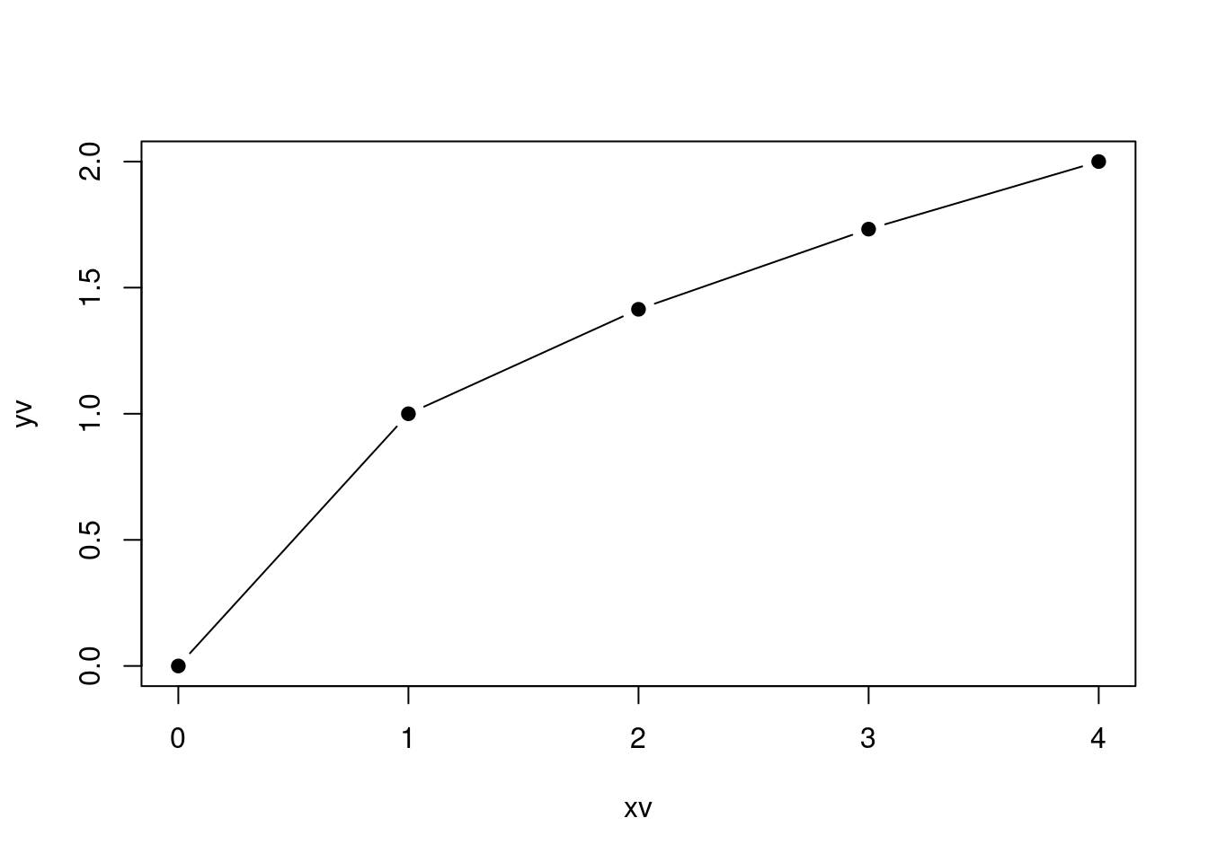
--------------We next plot these points into a coordinate system using the plot() function from the matplotlib.pyplot sub-library. Figure 8.7 shows the graph.
plot(xv, yv, type = "p", pch = 1, lty = 0)In the above plot the arguments are:
-
pchdetermines the marker shape according to:argument shape pch = 0 square pch = 1 circle pch = 2 triangle point up pch = 3 plus pch = 4 cross pch = 5 diamond pch = 6 triangle point down pch = 7 square cross pch = 8 star pch = 9 diamond plus pch = 10 circle plus pch = 11 triangles up and down pch = 12 square plus pch = 13 circle cross pch = 14 square and triangle down pch = 15 filled square pch = 16 filled circle pch = 17 filled triangle point-up pch = 18 filled diamond pch = 19 solid circle pch = 20 bullet (smaller circle) pch = 21 filled circle blue pch = 22 filled square blue pch = 23 filled diamond blue pch = 24 filled triangle point-up blue pch = 25 filled triangle point down blue -
typecharacter indicating the type of plotting. Allowed values are:symbol explanation “p” points “l” lines “b” both points and lines “c” empty points joined by lines “o” overplotted points and lines “s” stair steps “n” does not produce any points or lines -
ltyline types can either be specified as an integer:- 0=blank
- 1=solid (default)
- 2=dashed
- 3=dotted
- 4=dotdash
- 5=longdash
- 6=twodash, or as one of the character strings
- “blank”
- “solid”
- “dashed”
- “dotted”
- “dotdash”
- “longdash”, or
- “twodash”,
where “blank” uses ‘invisible lines’ (i.e., does not draw them).
If you would like to connect the dots, you can change the code to:
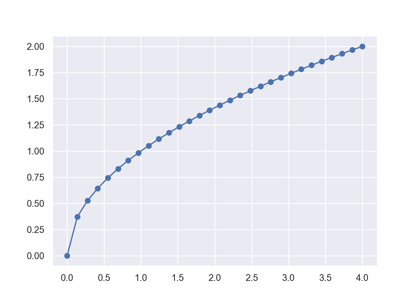
plot(xv, yv, type = "b", pch = 19, lty =1)This graph looks still a bit choppy. If you would like a smoother graph you need to evaluate the function using more points. We can also generate the x-grid automatically using the linspace function from the numpy library. We then calculate the corresponding y values with :math:` y = sqrt(x)` for each one of the x grid-points and record them in a yv vector.
xv = np.linspace(0, 4, 30) # Generates 30 points between 0 and 4
yv = np.zeros(len(xv))
for i in range(len(xv)):
yv[i] = np.sqrt(xv[i])
plt.plot(xv, yv, '-o')
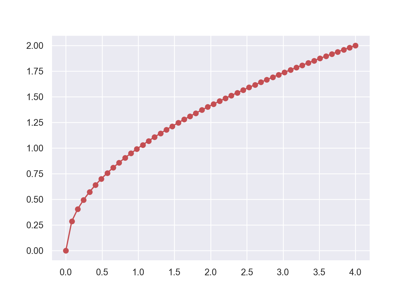
plt.show()Finally we use a very powerful feature that all functions of the numpy library have in common. It is called vector evaluation. This means that any function in the numpy library can be applied on a vector without a loop which results in a new vector containing the results of the function evaluations on each point in the original vector. Sounds complicated but is really easy. And just to make the function even smoother we add some more points and plot it in the color red, look:
8.2.2 Second Example Using subplots()
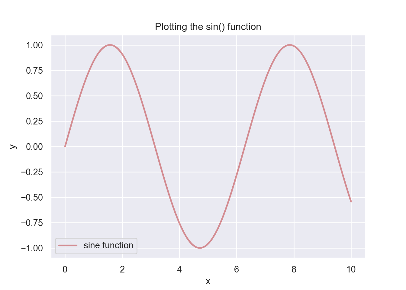
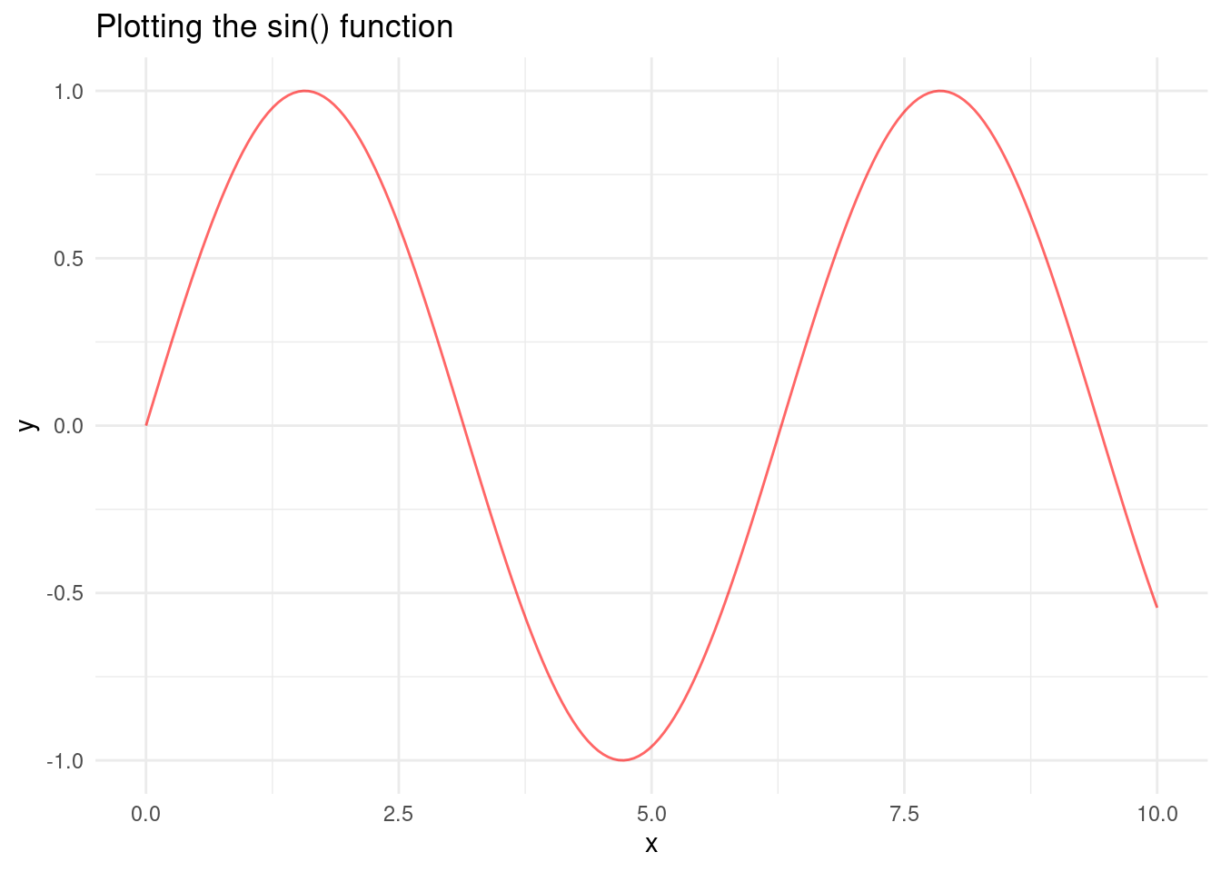
Here is another example of a simple function, the \(y = sin(x)\) function. When we plot this function we use a more powerful plotting function called subplots(). This will allow us to plot multiple graphs into a single figure. I now also add labels to the graph and a legend. We also use the sin() function from the numpy library which allows us to use vector evaluation again so that we do not have to write a loop to evaluate the x-grid values.
You should always have a title and labels in your figures!
library(ggplot2)

xv <- seq(0, 10, length.out = 200)
yv <- sin(xv)

data <- data.frame(x = xv, y = yv)

ggplot(data, aes(x = x, y = y)) +
  geom_line(color = "red", linetype = "solid", alpha = 0.6) +
  labs(title = "Plotting the sin() function", x = "x", y = "y") +
  theme_minimal() +
  theme(legend.position = "best")
8.2.3 Plotting Multiple Functions into a Graph
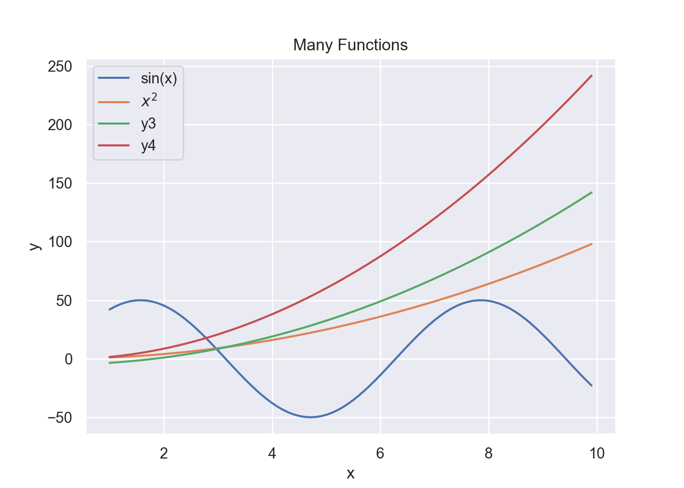
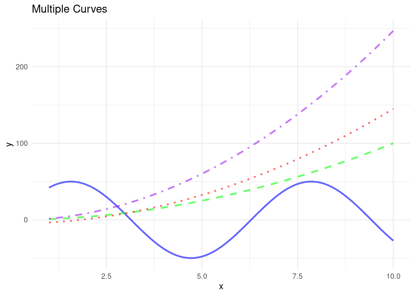
Here is another example with some more functions. We again first define the input vector xv with the values we want to evaluate the function at and then specify the “output” vector yv as \(y = f(x)\). We use the following examples:
- \(f(x) = 50 \times sin(x)\),
- \(f(x) = x^2\),
- \(f(x) = 3 \times (x^2)/2 - 5\), and finally
- \(f(x) = 5 \times (x^2)/2 - \sqrt{x}\).
xv = np.arange(1, 10, 0.1)
y1v = 50*np.sin(xv)
y2v = xv**2
y3v = 3.0*(xv**2)/2 - 5
y4v = 5.0*(xv**2)/2 - np.sqrt(xv)
xv <- seq(1, 10, by = 0.1)
y1v <- 50 * sin(xv)
y2v <- xv^2
y3v <- 3.0 * (xv^2) / 2 - 5
y4v <- 5.0 * (xv^2) / 2 - sqrt(xv)
data <- data.frame(x = xv, y1 = y1v, y2 = y2v, y3 = y3v, y4 = y4v)We have now two columns of values: x and y that we can plot against each other into a coordinate system.
library(ggplot2)
ggplot(data) +
  geom_line(aes(x = x, y = y1), color = "blue", linetype = "solid", size = 1, alpha = 0.6) +
  geom_line(aes(x = x, y = y2), color = "green", linetype = "dashed", size = 1, alpha = 0.6) +
  geom_line(aes(x = x, y = y3), color = "red", linetype = "dotted", size = 1, alpha = 0.6) +
  geom_line(aes(x = x, y = y4), color = "purple", linetype = "dotdash", size = 1, alpha = 0.6) +
  labs(title = "Multiple Curves", x = "x", y = "y") +
  theme_minimal() +
  theme(legend.position = "top")
8.3 Subplots
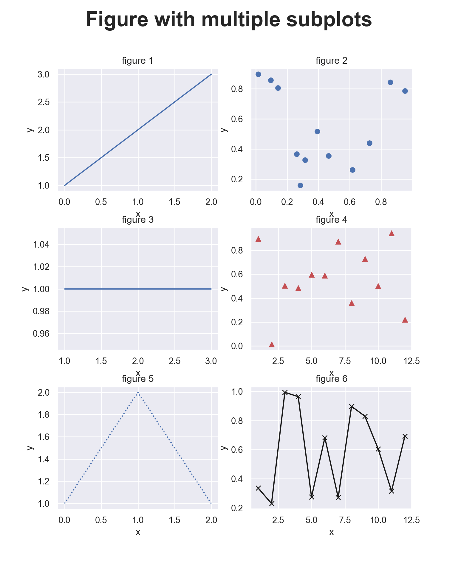
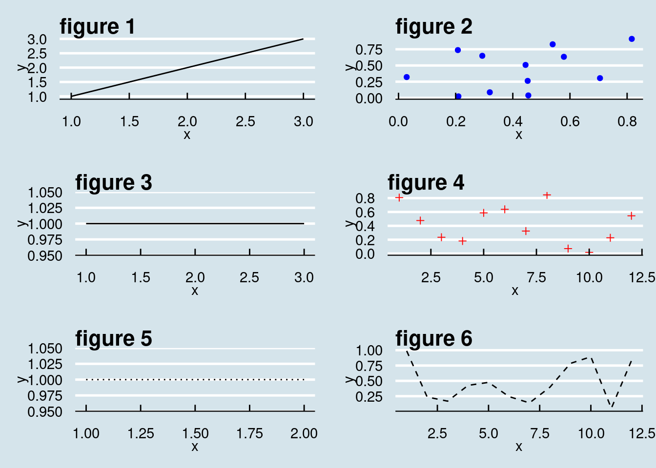
If we have more than one figure it might be good to put them all into one graph. In the following example we plot 6 figures into one picture. We plot into 3 rows and 2 columns. You can obviously rearrange all this.
# Creates  a 3 x 2 grid of subplots
num_rows = 3
num_cols = 2
title_size = 26

fig = plt.figure(figsize=(8, 10))
fig.suptitle("Figure with multiple subplots", \
    fontsize=title_size, fontweight='bold')
plt.subplots_adjust(wspace=0.2, hspace=0.3)

# [1]
ax = plt.subplot2grid((num_rows, num_cols), (0,0))
ax.plot([1,2,3])
ax.set_title('figure 1')
ax.set_xlabel('x')
ax.set_ylabel('y')
# [2]
ax = plt.subplot2grid((num_rows, num_cols), (0,1))
ax.plot(np.random.rand(12), np.random.rand(12), 'bo')
ax.set_title('figure 2')
ax.set_xlabel('x')
ax.set_ylabel('y')
# [3]
ax = plt.subplot2grid((num_rows, num_cols), (1,0))
ax.plot(np.array([1,2,3]), np.array([1,1,1]))
ax.set_title('figure 3')
ax.set_xlabel('x')
ax.set_ylabel('y')
# [4]
ax = plt.subplot2grid((num_rows, num_cols), (1,1))
ax.plot(np.linspace(1,12,12), np.random.rand(12), 'r^')
ax.set_title('figure 4')
ax.set_xlabel('x')
ax.set_ylabel('y')
# [5]
ax = plt.subplot2grid((num_rows, num_cols), (2,0))
ax.plot([1,2,1],':')
ax.set_title('figure 5')
ax.set_xlabel('x')
ax.set_ylabel('y')
# [6]
ax = plt.subplot2grid((num_rows, num_cols), (2,1))
ax.plot(np.linspace(1,12,12), np.random.rand(12), 'k-x')
ax.set_title('figure 6')
ax.set_xlabel('x')
ax.set_ylabel('y')

plt.show()library(ggplot2)
library(gridExtra)
# Create plots for each subplot
plot1 <- ggplot() +
geom_line(data = data.frame(x = c(1, 2, 3), y = c(1, 2, 3)), aes(x = x, y = y)) +
labs(title = "figure 1", x = "x", y = "y")
plot2 <- ggplot() +
geom_point(data = data.frame(x = runif(12), y = runif(12)), aes(x = x, y = y), color = "blue") +
labs(title = "figure 2", x = "x", y = "y")
plot3 <- ggplot() +
geom_line(data = data.frame(x = c(1, 2, 3), y = c(1, 1, 1)), aes(x = x, y = y)) +
labs(title = "figure 3", x = "x", y = "y")
plot4 <- ggplot() +
geom_point(data = data.frame(x = seq(1, 12, length.out = 12), y = runif(12)), aes(x = x, y = y), color = "red", shape = 3) +
labs(title = "figure 4", x = "x", y = "y")
plot5 <- ggplot() +
geom_line(data = data.frame(x = c(1, 2, 1), y = c(1, 1, 1)), aes(x = x, y = y), linetype = "dotted") +
labs(title = "figure 5", x = "x", y = "y")
plot6 <- ggplot() +
geom_line(data = data.frame(x = seq(1, 12, length.out = 12), y = runif(12)), aes(x = x, y = y), color = "black", linetype = "dashed") +
labs(title = "figure 6", x = "x", y = "y")
# Combine plots into a 3x2 grid
grid.arrange(plot1, plot2, plot3, plot4, plot5, plot6, ncol = 2)8.4 3D-Graphs
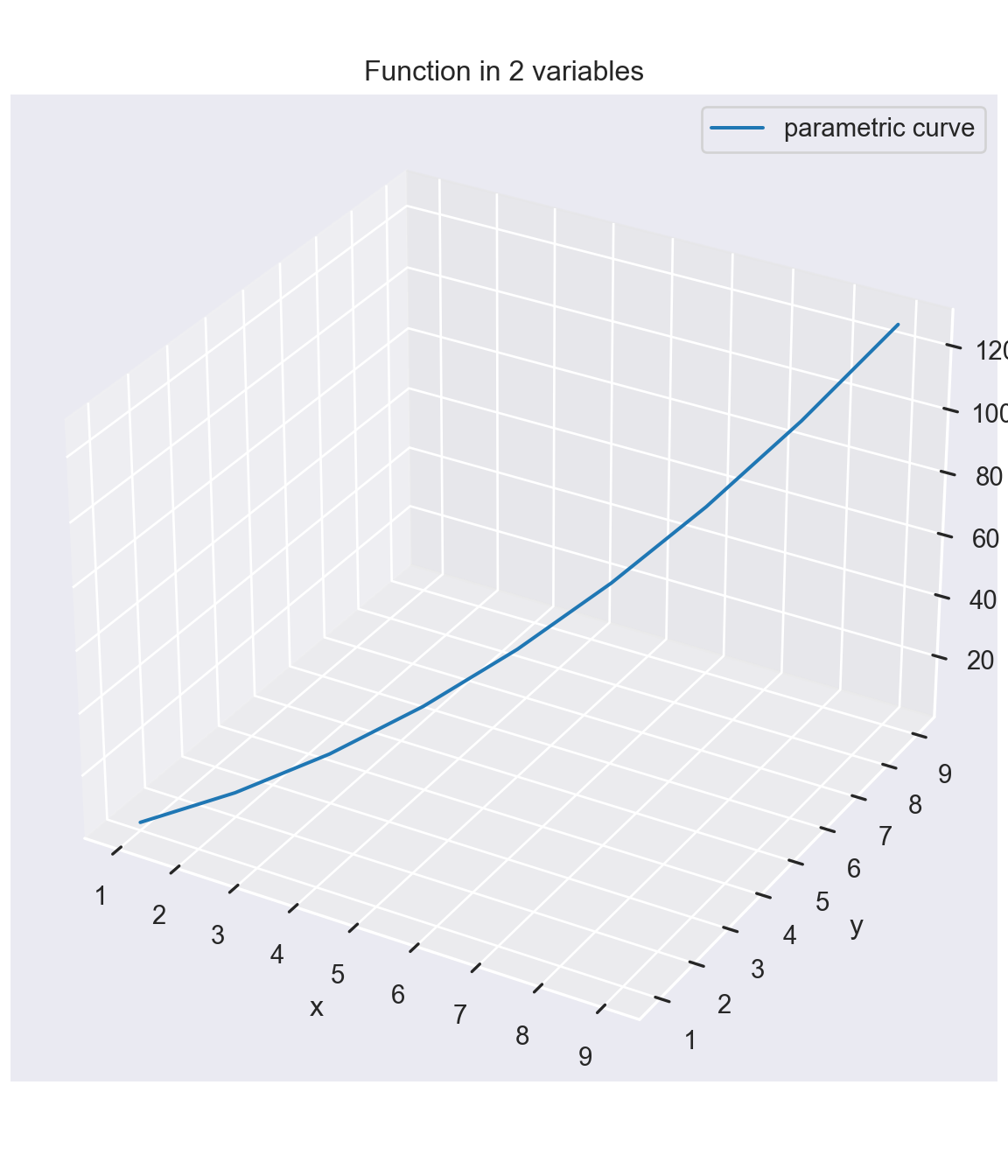
Finally, we can also plot 3-D graphs in Python. The function we would like to plot is
\[f(x,y) = 3.0 \frac{y^2}{2.0} + x - \frac{\sqrt{x \times y}}{5.0}.\]
We start by defining an x-grid and a y-grid vector. We then evaluate the function at these values.
import matplotlib.pyplot as plt
from matplotlib import cm
import numpy as np

plt.style.use('_mpl-gallery')

# Define x and y grid vectors
xv = np.arange(1, 10, 1)
yv = np.arange(1, 10, 1)
n = len(xv)

# Evaluation function at grid values
zv = 3 * yv**2 /2 + xv - np.sqrt(xv*yv) /5

ax = plt.figure(figsize=(6, 7)).add_subplot(projection='3d')
ax.plot(xv, yv, zv, zdir='z', label='parametric curve')
ax.set_title('Function in 2 variables')
ax.set_xlabel('x')
ax.set_ylabel('y')
ax.set_zlabel('f(x,y)')
ax.legend()
plt.show()library(rgl)
# Define x and y grid vectors
xv <- seq(1, 10, by = 1)
yv <- seq(1, 10, by = 1)
n <- length(xv)
# Evaluation function at grid values
zv <- 3 * yv^2 / 2 + xv - sqrt(xv * yv) / 5
# Create a 3D scatter plot
plot3d(x = xv, y = yv, z = zv, type = "l", col = "blue",
xlab = "x", ylab = "y", zlab = "f(x, y)",
main = "Function in 2 variables")
rglwidget()3D plot
The problem with this approach is that the function gets only evaluated at the 45-degree line, that is at points (x=1, y=1), (x=2, y=2), …, (x=10, y=10). This is not really what we had in mind.
8.5 3D-Meshplots of Surfaces
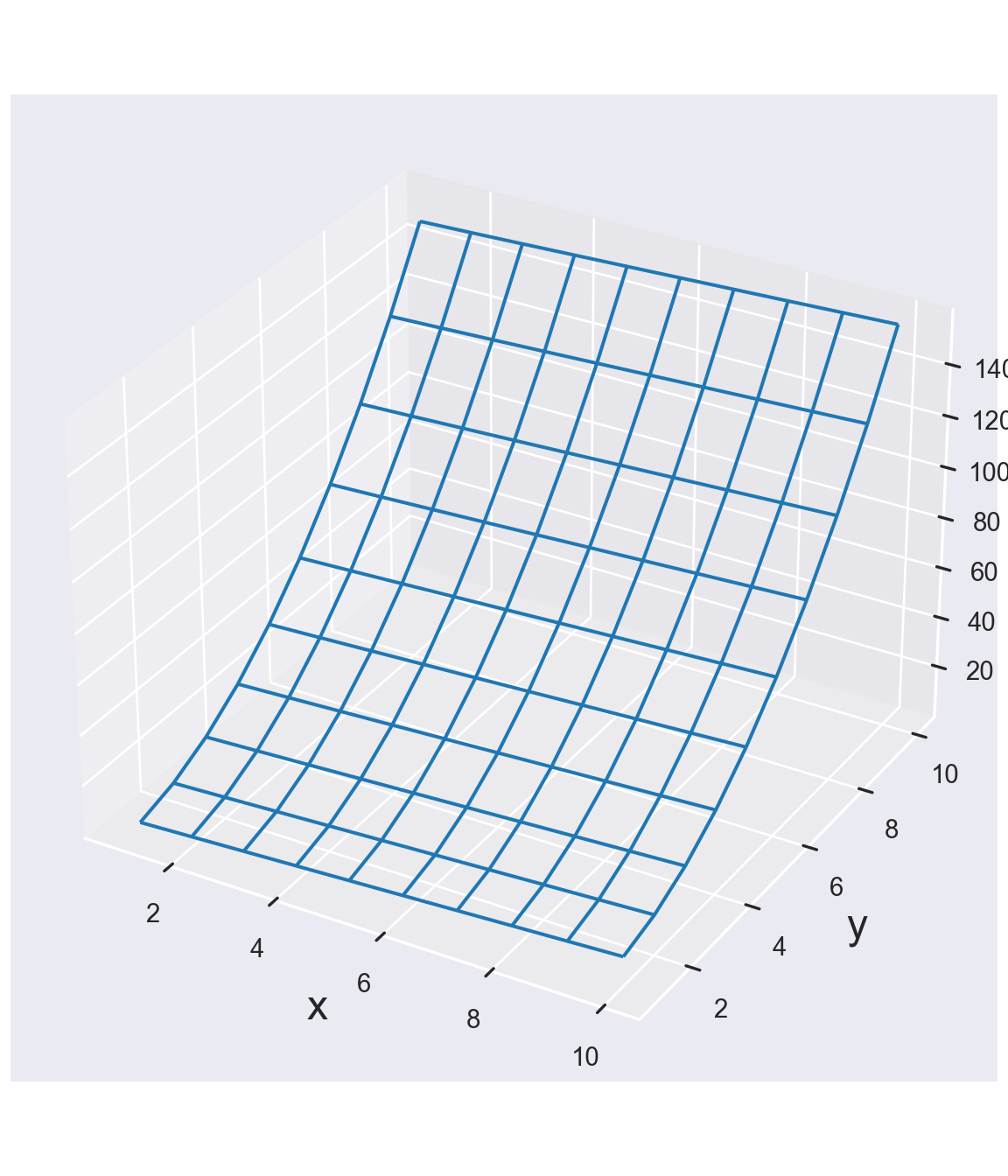
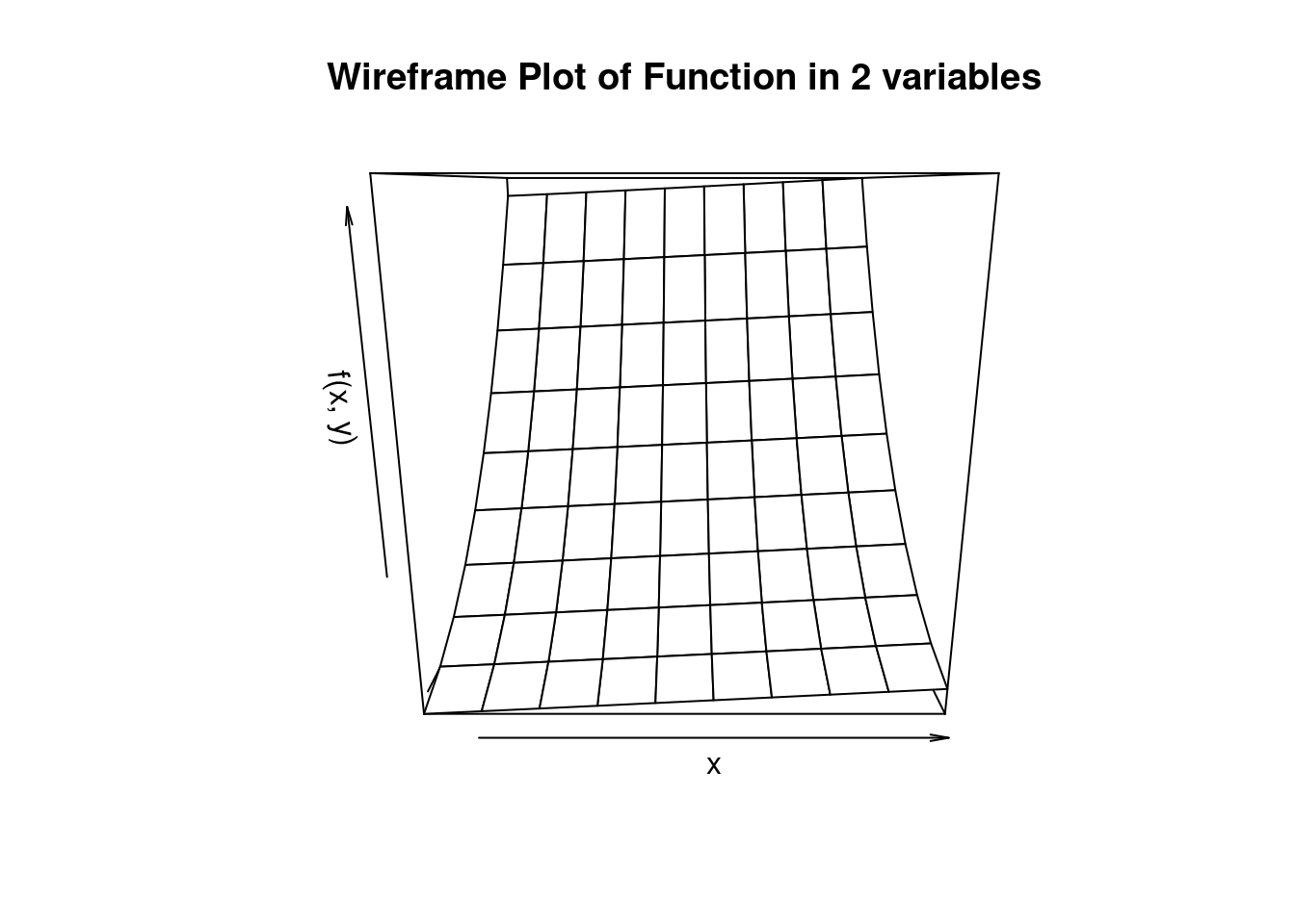
In order to plot the entire “surface” of the function \(f(x,y)\) we need to specify value pairs of x and y over the entire gridspace of the x/y plane. We use the command meshgrid in order to accomplish this. We then evaluate the function \(f(x,y)\) for each point on this “meshgrid” which results in a surface plot of the function.
import matplotlib.pyplot as plt

plt.style.use('_mpl-gallery')

# Define grids in x and y dimension
xv = np.linspace(1, 10, 10)
yv = np.linspace(1, 10, 10)

# Span meshgrid over entire x/y plane
X, Y = np.meshgrid(xv, yv)

# Evaluate function at each point in the x/y plane
Z = 3.0 * Y**2.0 /2.0 + X - np.sqrt(X*Y) /5.0

# Plot
ax = plt.figure(figsize=(6, 7)).add_subplot(projection='3d')
ax.plot_wireframe(X, Y, Z, rstride=1, cstride=1)
ax.set_xlabel('x', fontsize=18)
ax.set_ylabel('y', fontsize=18)
ax.set_zlabel('f(x,y)', fontsize=18)
plt.show()
# Define grids in x and y dimension
xv <- seq(1, 10, length.out = 10)
yv <- seq(1, 10, length.out = 10)
# Evaluate function at each point in the x/y plane
Z_values <- function(X,Y) {
3.0 * Y^2 / 2 + X - sqrt(X * Y) / 5
}
Z = outer(xv, yv, Z_values)
# Create a wireframe plot
persp(xv, yv, Z, # Pass X, Y, Z as matrices directly
xlab = "x", ylab = "y", zlab = "f(x, y)",
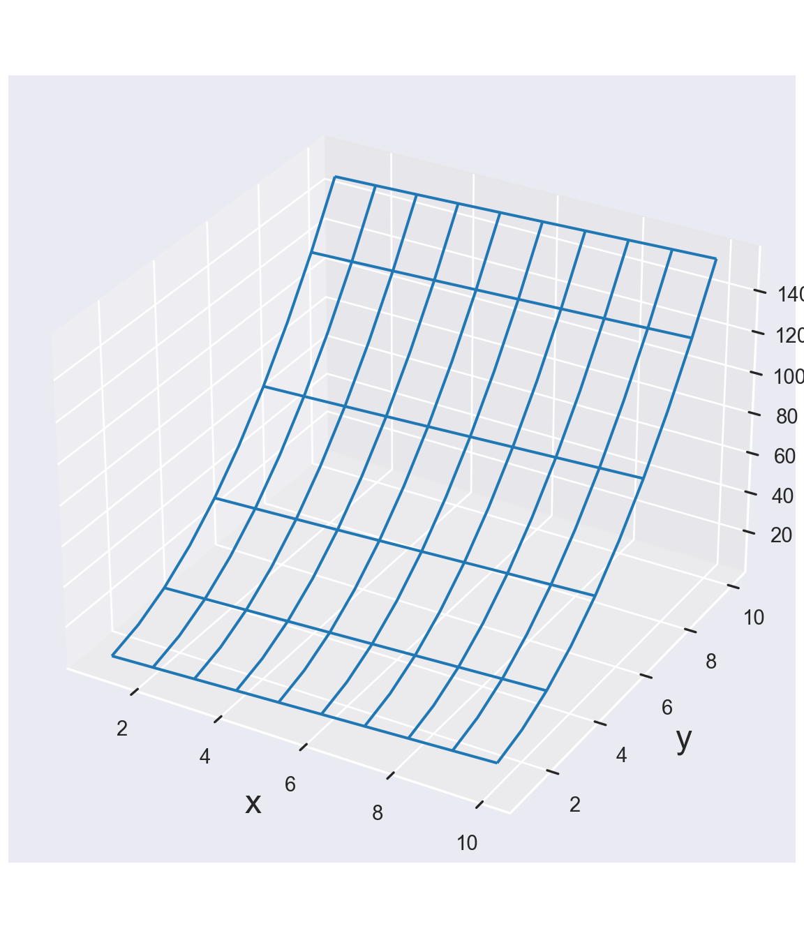
main = "Wireframe Plot of Function in 2 variables")The rstride and cstride command tells the function to take every point on rstride=2 then it would “downsample” the meshgrid and only take every other point in the row-dimension. It will produce a less smooth graph. Here’s the example for rstride=2.
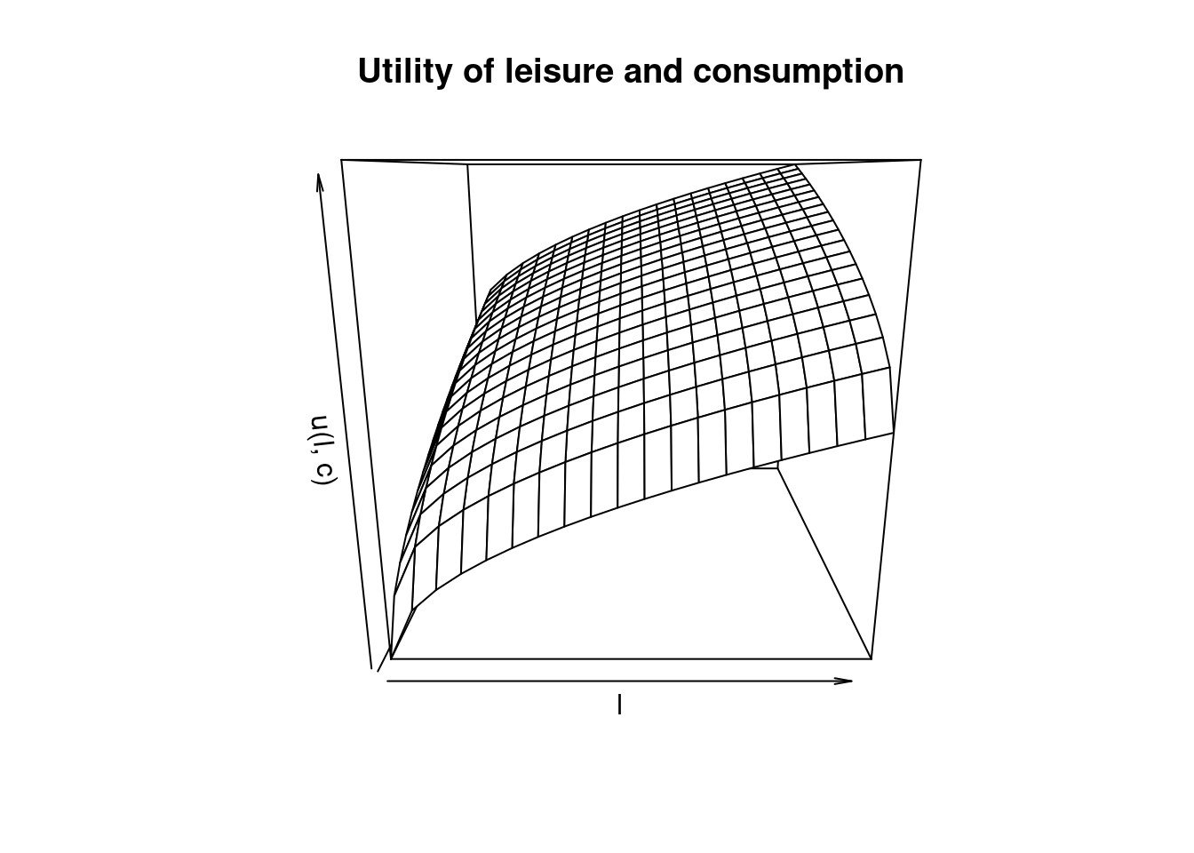
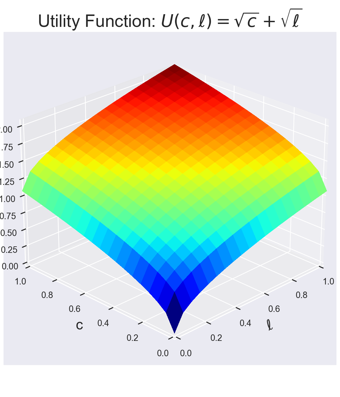
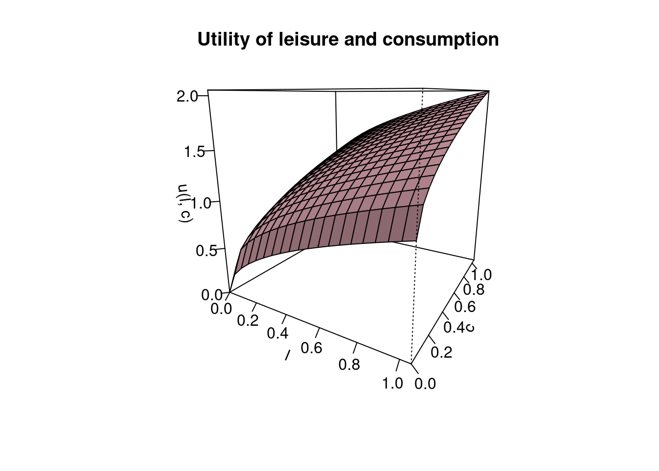
8.6 3D-Utility Function Graphs
We first start with some definitions of the consumption and leisure grid. We then evaluate the utility at all the consumption-leisure combination points.
titleSize = 22
legendSize = 16
labelSize = 18
tickSize = 16

# Define grids in x and y dimension
lv = np.linspace(0.0, 1.05, 20)
cv = np.linspace(0.0, 1.05, 20)

# Span meshgrid over entire x/y plane
L,C = np.meshgrid(lv, cv)

# Evaluate function at each point in the x/y plane
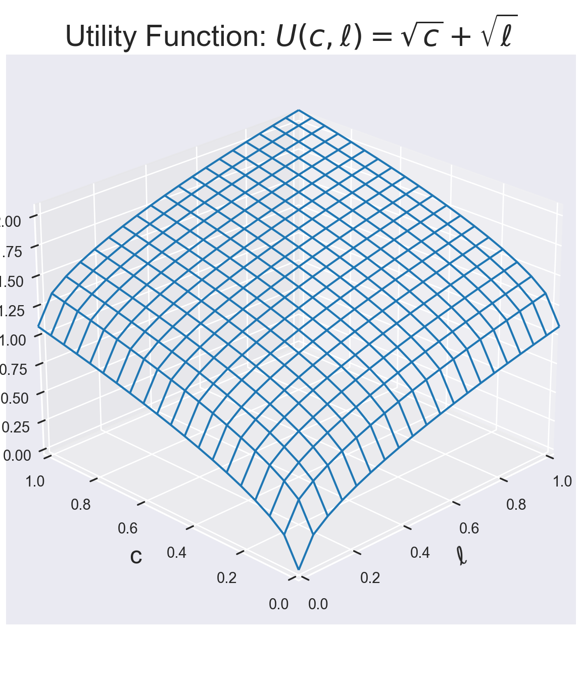
U = np.sqrt(L) + np.sqrt(C)We can now plot the utility function. We plot it first as Wire-Frame graph.
# Plot the result
ax = plt.figure(figsize=(6, 7)).add_subplot(projection='3d')
ax.plot_wireframe(L,C, U, rstride=1, cstride=1)
ax.set_title(r'Utility Function: $U(c,\ell)=\sqrt{c}+\sqrt{\ell}$', fontsize=titleSize)
ax.set_xlabel('$\ell$', fontsize=labelSize)
ax.set_ylabel('c', fontsize=labelSize)
ax.set_zlabel('$U(c,\ell)$', fontsize=labelSize)
ax.set_xlim([0,1])
ax.set_ylim([0,1])
ax.view_init(elev=25., azim=225)
plt.show()
(0.0, 1.0)
(0.0, 1.0)# Create a wireframe plot
persp(lv, cv, U, # Pass l, c, U as vectors and matrix
xlab = "l", ylab = "c", zlab = "u(l, c)",
main = "Utility of leisure and consumption")We can also fill in the graph a bit more using the plot_surface command.
# Plot the result
ax = plt.figure(figsize=(6, 7)).add_subplot(projection='3d')
ax.plot_surface(L,C, U, rstride=1, cstride=1, cmap = plt.cm.jet, \
linewidth=0, antialiased=False)
ax.set_title(r'Utility Function: $U(c,\ell)=\sqrt{c}+\sqrt{\ell}$', fontsize=titleSize)
ax.set_xlabel('$\ell$', fontsize=labelSize)
ax.set_ylabel('c', fontsize=labelSize)
ax.set_zlabel('$U(c,\ell)$', fontsize=labelSize)
ax.set_xlim([0,1])
ax.set_ylim([0,1])
ax.view_init(elev=25., azim=225)
plt.show()(0.0, 1.0)
(0.0, 1.0)# Create a wireframe plot
persp(lv, cv, U, # Pass l, c, U as vectors and matrix
xlab = "l", ylab = "c", zlab = "u(l, c)",
main = "Utility of leisure and consumption",
col='pink', shade=.4, theta = 30, phi = 15, ticktype='detailed')8.7 Contour Plots
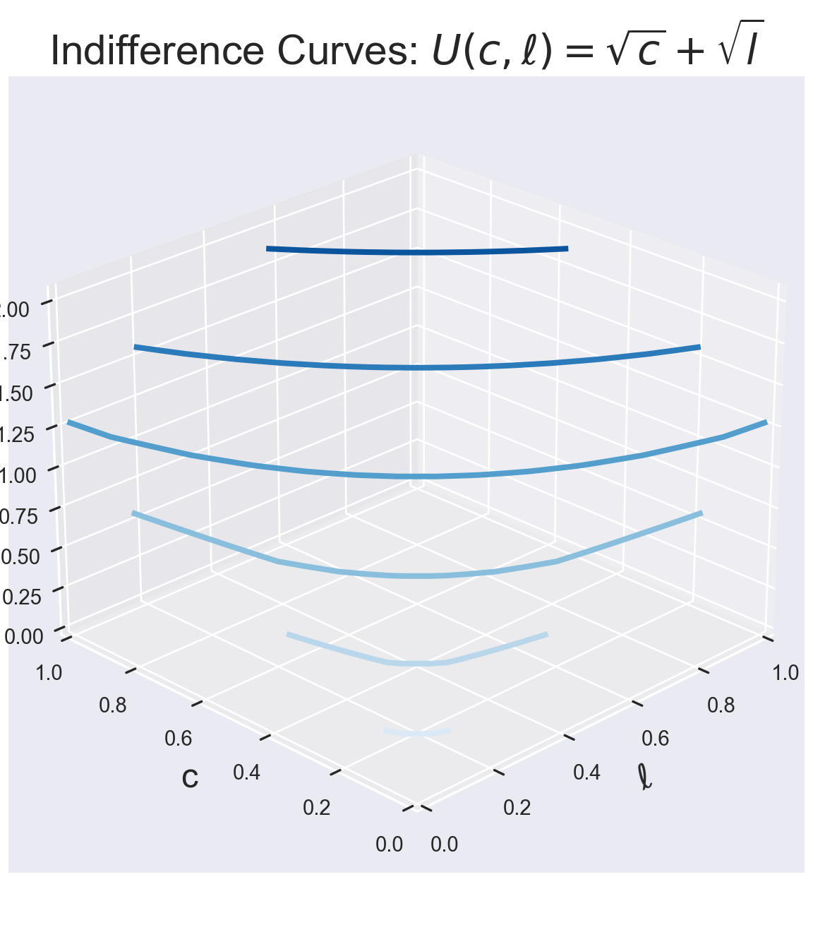
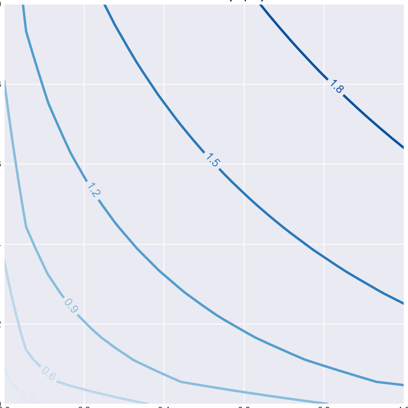
We next plot some of the indifference curves into the utility “mountain”. This is accomplished with so called contour plot functions.
ax = plt.figure(figsize=(6, 7)).add_subplot(projection='3d')
ax.contour(L,C, U, linewidths=3)
ax.view_init(elev=25., azim=225)
ax.set_title(r"Indifference Curves: $U(c,\ell)=\sqrt{c}+\sqrt{l}$", fontsize=titleSize)
ax.set_xlabel('$\ell$', fontsize=labelSize)
ax.set_xlim([0,1])
ax.set_ylim([0,1])
ax.set_ylabel('c', fontsize=labelSize)
ax.set_zlabel('$U(c,\ell)$', fontsize=labelSize)
plt.show()<matplotlib.contour.QuadContourSet object at 0x7ff3a40cb850>
(0.0, 1.0)
(0.0, 1.0)We next show the 2-dimensional representation of the indifference curves.
fig, ax = plt.subplots(figsize=(7, 7))
CS=ax.contour(L,C, U, linewidths=3)
ax.set_title(r'Indifference Curves: $U(c,\ell)=\sqrt{c}+\sqrt{\ell}$', fontsize=titleSize)
ax.set_xlabel('$\ell$', fontsize=labelSize)
ax.set_ylabel('c', fontsize=labelSize)
ax.set_xlim([0,1])
ax.set_ylim([0,1])
ax.clabel(CS, inline=1, fontsize=14)
plt.show()
(0.0, 1.0)
(0.0, 1.0)
Attaching package: 'plotly'The following object is masked from 'package:ggplot2':
last_plotThe following object is masked from 'package:stats':
filterThe following object is masked from 'package:graphics':
layout- Plotting a vector.
- The plot command needs two vectors that hold the coordinates of points you would like to plot
- Use titles and label the axes in your plots.
- Generate a random vector with 10 entries.
- Plot this vector.
